
Jay Z’s relaunch of Norway-born streaming service Tidal this week brought with it plenty of implied barbs for the service’s dominant rival, Spotify.
Without any specific announcements about Tidal’s supposed superior royalty payouts, Alicia Keys said at the brief New York event on Monday that Tidal’s equity-owning backers wanted to “create a better service and a better experience for both fans and artists”.
Yet a quick visual comparison of Tidal with Spotify suggests that this ‘better service’ has taken rather a lot of unsubtle inspiration from Daniel Ek‘s creation.
Spotify was given a sleek new noir design last April. The firm trumpeted the move in an excited announcement, saying that it was going to ‘Paint It Black’.
Headline changes included improvements to the service’s ‘Browse’ feature, of which Spotify teased: “Regardless of whether you’re looking for something to fall asleep to, or the perfect playlist to get you geared up for your big night out, finding the right music for every moment is easier than ever.”
Remember that description when you look at the comparison shots of Spotify’s web player and Tidal’s equivalent below.
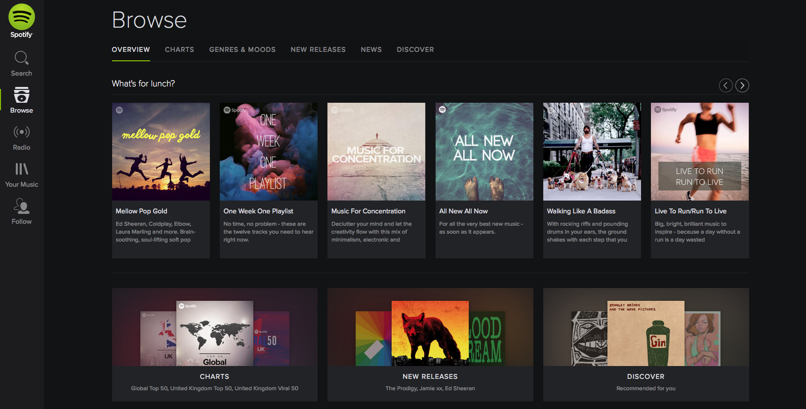
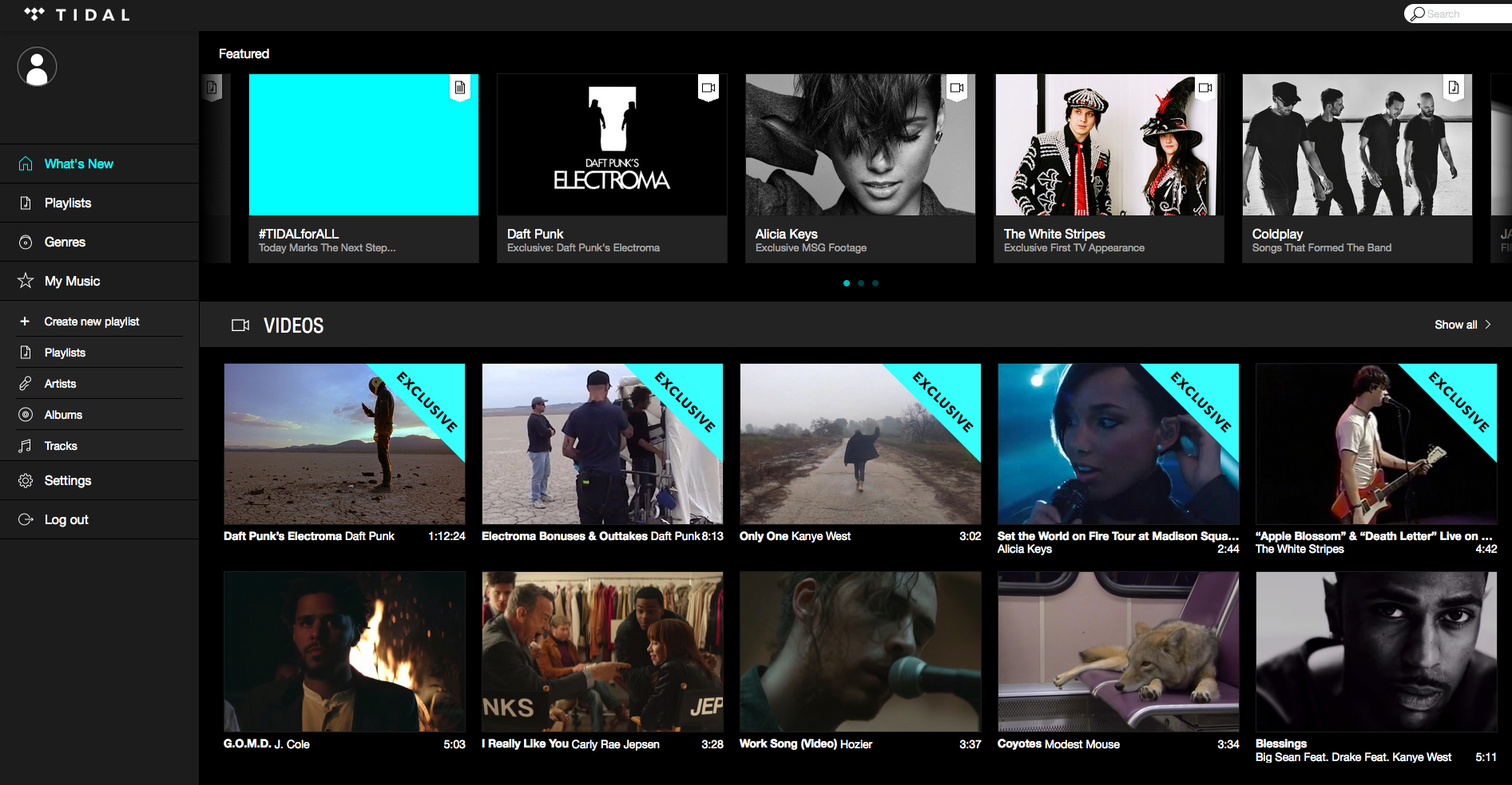
Homepage / ‘browse’
The narrow left-hand margin of Spotify’s platform certainly differs to Tidal’s stuck-out equivalent, while Tidal’s turqoise third colour is used to hammer home the ‘EXCLUSIVE’ nature of its video content.
These elements of window dressing aside, it’s fair to say these two landing pages for both platforms look pretty similar: lots of squares with sharp edges with a grey-on-black design throughout.
Of a type, then, but enough differentiation for us to tell one from the other.


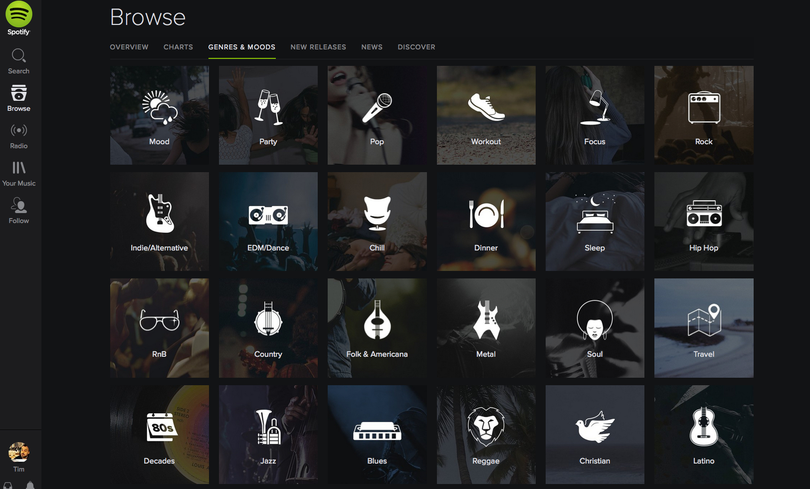
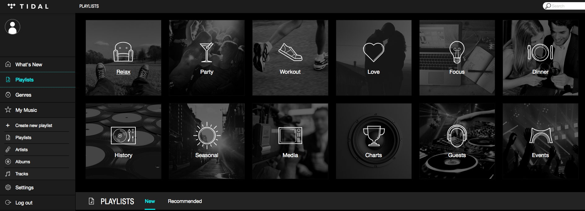
‘GENRES & MOODS’ / ‘GENRES’
Okay.
Although Spotify doesn’t have a direct category equivalent to Tidal’s main ‘Genres’ area, it does have a helpful sub-category that fits the bill nicely: ‘Genres & Moods’.
The difference between these two is… well… pretty non-existent.
Tidal has even struck upon the same moods/situations for these playlists, including ‘Workout’, ‘Focus’, ‘Dinner’ and ‘Party’.


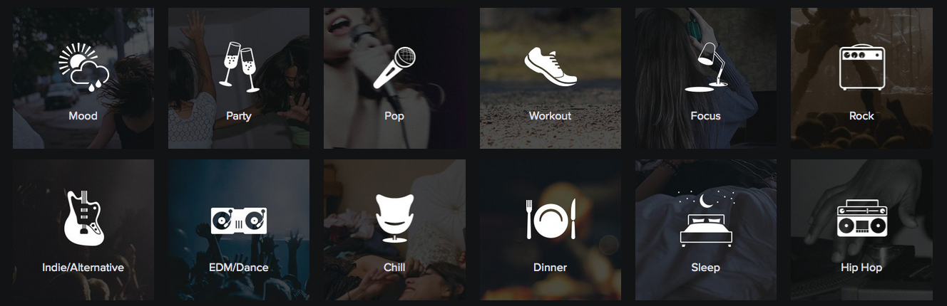
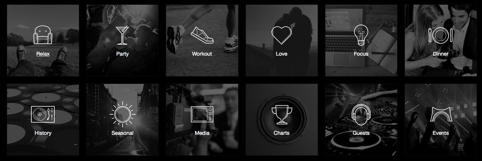
Here, if you’re not seeing it, is what those two ‘mood boards’ – removed of all other digital paraphernalia – look like side-by-side.
Notice not only the overall design theme, but the square buttons and the spacing; not to mention the actual icons denoting each mood/occasion, and the evocative blurred photography in the background.
Everything, essentially.


Can you tell which is Spotify’s and which is Tidal’s?
Exactly.
It doesn’t get much clearer on their responsive mobile sites, either.

‘Paint It Black’ indeed.
The Beatles remain unavailable on both platforms.Music Business Worldwide

